Informations
i) Exposure
In photography, exposure is the amount of light which reaches your camera sensor or film. It is a crucial part of how bright or dark your pictures appear.
There are only two camera settings that affect the actual “luminous exposure” of an image: shutter speed and aperture. The third setting, camera ISO, also affects the brightness of your photos, and it is equally important to understand. Also, you can brighten or darken a photo by editing it in post-processing software like Photoshop on your computer.
It sounds basic, but exposure is a topic which confuses even advanced photographers. The reason is simple: For every scene, a wide range of shutter speed, aperture, and ISO settings will result in a photo of the proper brightness. You haven’t “mastered exposure” once you can take a photo that’s the right brightness. Even your camera’s Auto mode will do that most of the time. Instead, getting the proper exposure for a photo is about balancing those three settings so the rest of the photo looks good, from depth of field to sharpness.
If you really want to master exposure, reading about it isn’t enough. You also need to go out into the field and practice what you’ve learned. There’s no quick-and-dirty way to pick up a skill like this. But if you can lay a solid groundwork, you’ll be at a huge advantage when you go out and practice it for yourself. The goal of this comprehensive article is to teach you all the basics that you need to know about exposure.
ii) Arpeture
Aperture is very similar to the “pupil” of your camera lens. Just like the pupil in your eye, it can open or shrink to change the amount of light that passes through. This is how the aperture blades look on a typical lens:
Your lens probably looks something like this. The shape in the middle is called the aperture. It is made up of several blades – nine of them in this case, but your lens may differ.
Aperture blades work a lot like the pupil in your eyes. At night, your pupils dilate so you can see things more easily. The same is true for aperture. When it is dark, you can open the aperture blades in your lens and let in more light. Aperture is written as f/Number. For example, you can have an aperture of f/2, or f/8, or f/16, and so on.
It is very important to remember that aperture is a fraction. This is the biggest mistake beginners make when they talk about aperture. If you get this wrong, it will be difficult to remember how aperture works or use it yourself to capture the right exposure in the field.
Typically, the largest aperture you can set will be something like f/1.4, f/1.8, f/2, f/2.8, f/3.5, f/4, or f/5.6. It changes from lens to lens. The smallest aperture on most lenses is something like f/16, f/22, or f/32. This diagram demonstrates the relative sizes of various aperture settings:
So, which aperture setting is best for photography and capturing the proper in-camera exposure? It depends upon the photo. Aperture influences many parts of an image, but it has two effects that are more important than anything else: exposure and depth of field.
iii) Shutter speed
The camera's shutter speed, the lens's aperture (also called f-stop), the Film Speed (a.k.a. ISO), and the scene's luminance together determine the amount of light that reaches the film or sensor (the exposure). Exposure value (EV) is a quantity that accounts for the shutter speed and the f-number. Once the sensitivity to light of the recording surface (either film or sensor) is set in numbers expressed in "ISOs" (ex: 200 ISO, 400 ISO), the light emitted by the scene photographed can be controlled through aperture and shutter-speed to match the film or sensor sensitivity to light. This will achieve a good exposure when all the details of the scene are legible on the photograph. Too much light let into the camera results in an overly pale image (or "over-exposure") while too little light will result in an overly dark image (or "under-exposure").
Multiple combinations of shutter speed and f-number can give the same exposure value (E.V.). According to exposure value formula, doubling the exposure time doubles the amount of light (subtracts 1 EV). Reducing the aperture size at multiples of one over the square root of two lets half as much light into the camera, usually at a predefined scale of f/1, f/1.4, f/2, f/2.8, f/4, f/5.6, f/8, f/11, f/16, f/22, and so on. For example, f/8 lets 4 times more light into the camera as f/16 does. A shutter speed of 1⁄50 s with an f/4 aperture gives the same exposure value as a 1⁄100 s shutter speed with an f/2.8 aperture, and also the same exposure value as a 1⁄200 s shutter speed with an f/2 aperture, or 1⁄25 s at f/5.6.
In addition to its effect on exposure, the shutter speed changes the way movement appears in photographs. Very short shutter speeds can be used to freeze fast-moving subjects, for example at sporting events. Very long shutter speeds are used to intentionally blur a moving subject for effect.[2] Short exposure times are sometimes called "fast", and long exposure times "slow".
iv) Composition
Composition is a way of guiding the viewer’s eye towards the most important elements of your work, sometimes – in a very specific order. A good composition can help make a masterpiece even out of the dullest objects and subjects in the plainest of environments. On the other hand, a bad composition can ruin a photograph completely, despite how interesting the subject may be. A poorly judged composition is also not something you can usually fix in post-processing, unlike simple and common exposure or white balance errors. Cropping can sometimes save an image, but only when tighter framing and removal of certain portions of the image is the correct solution. That is why giving your choice of composition plenty of thought before capturing an image is a step of utmost importance.
Focal length, aperture, angle at which you choose to position your camera relative to your subject also greatly affects composition. For example, choosing a wider aperture will blur the background and foreground, effectively lessening the importance of objects placed in there. It will also more often than not result in more noticeable corner shading (vignetting), which will help keep viewer’s eye inside the frame for longer. On the other hand, closing down the aperture will bring more objects into focus which, in turn, may result in better image balance. How so? Well, “sharper”, more in-focus objects may attract more attention than a blurry shape, but not always (see image sample below). An experienced photographer will use all the available means to achieve the desired result. It is worth noting that de-focusing objects in the foreground or background does not negate their contribution to overall composition of the image. Simple shapes, tones, shadows, highlights, colors are all strong elements of composition.
v) Rule of Third
The rule of thirds is a "rule of thumb" or guideline which applies to the process of composing visual images such as designs, films, paintings, and photographs.[1] The guideline proposes that an image should be imagined as divided into nine equal parts by two equally spaced horizontal lines and two equally spaced vertical lines, and that important compositional elements should be placed along these lines or their intersections.[2] Proponents of the technique claim that aligning a subject with these points creates more tension, energy and interest in the composition than simply centering the subject.
The photograph to the right demonstrates the application of the rule of thirds. The horizon sits at the horizontal line dividing the lower third of the photo from the upper two-thirds. The tree sits at the intersection of two lines, sometimes called a power point[3] or a crash point[4]. Points of interest in the photo do not have to actually touch one of these lines to take advantage of the rule of thirds. For example, the brightest part of the sky near the horizon where the sun recently set does not fall directly on one of the lines, but does fall near the intersection of two of the lines, close enough to take advantage of the rule
vi) Depth Of field
Depth of field is the amount of your scene, from front to back, that appears sharp. In a landscape photo, your depth of field might be huge, stretching from the foreground to the horizon. In a portrait photo, your depth of field might be so thin that only your subject’s eyes are sharp.
Aperture changes your depth of field, which makes a big difference if you want to capture the best possible photographs. Changing the depth of field in an image will alter the way it looks completely.
To be specific, small apertures (like f/11 or f/16) give you a large depth of field. If you want everything from front to back to appear sharp, those are good settings to use. Large apertures (like f/1.4 or f/2.8) capture a much thinner depth of field, with a shallow focus effect. They are ideal if you are trying to isolate just a small part of your subject, making everything else blurred.
Here is a sample comparison:
vii) Balance
alance in photography is observed when an image has subject areas that look balanced throughout the composition. It is achieved by shifting the frame and juxtaposing subjects within it so objects, tones, and colors are of equal visual weight. An image is balanced when subject areas command a viewer’s attention equally.
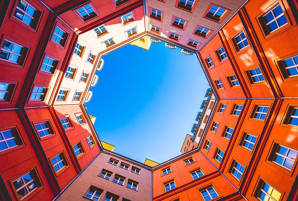
There are two main techniques of balance: formal and informal. However, there are also other kinds of formal and informal techniques that photographers have been practicing to balance out lightness and heaviness, varying shapes, and even meanings behind a composition.
Below you’ll find the five types of balance in photography to help you create more visually appealing and meaningful photographs.
Symmetrical Balance

Also called formal balance, symmetrical balance is the most common way to photograph an image. After all, it’s natural for for people to place their main subjects right in the middle of the frame. Professionals and photography workshops often advise new photographers to avoid shooting their subjects front and center, but in the case of the photo above, it works perfectly in giving the main subject some visual emphasis and appeal.
In symmetrically balanced photos, both sides of the frame have equal weight and may even mirror each other. Subjects are intentionally centered to look perfectly symmetrical when split horizontally or vertically in half.
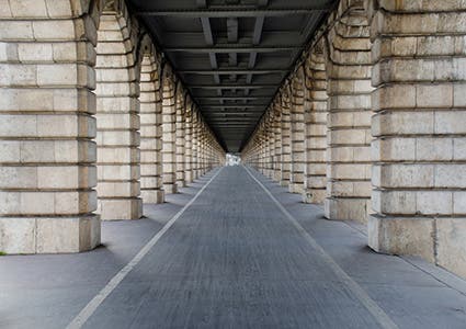
In the photo above, both the St. Charles church in Vienna and its mirror image on the pond are centered to create a symmetrical image. Meanwhile, the pillar-lined walkway below has balanced framing lines and borders that lead the eye to the middle and add visual appeal.
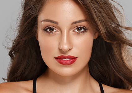
Finally, even though it’s usually not advisable to shoot portraits with the person right in the middle of the frame, it can sometimes be a good compositional technique for red carpet candids and beauty close-ups, as seen in the photo below (right).
Asymmetrical Balance
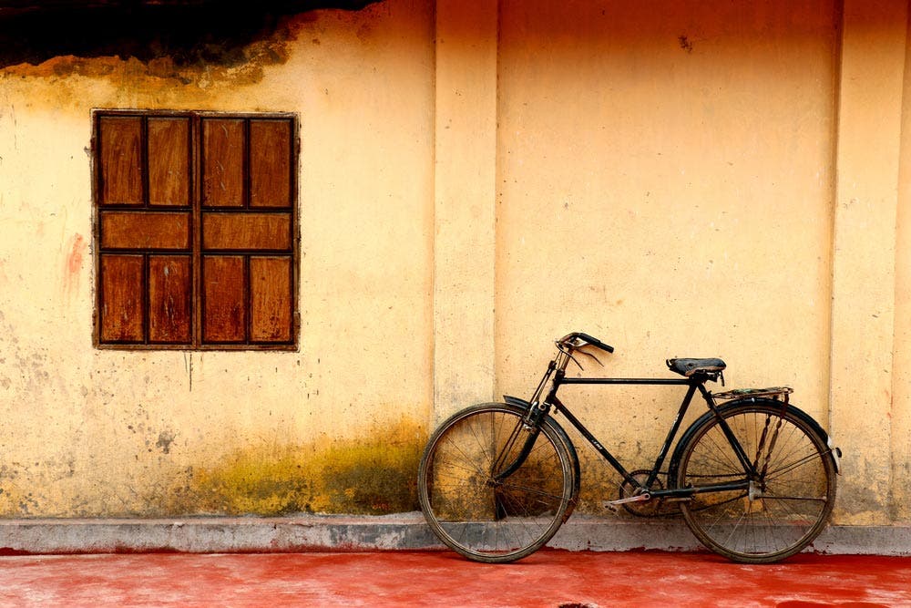
Also known as informal balance, it is the most common compositional technique taught in photography and art workshops. Since it requires intentionally placing your subject off center, it’s more difficult to achieve but gets easier with daily practice.
The rule of thirds puts asymmetrical balance to your advantage, as it suggests that the center of interest lies along the intersecting lines of an image that is divided vertically and horizontally by four lines. Other ways to create asymmetrical balance within the composition is by balancing out your main subject with another, less important subject that contrasts with the former in terms of size, color, or general appearance.
Take the image of the window and bike above. Not only are the subjects placed on the left and right side of the frame, they compliment each other by varying in size, thus creating balance in both size and subject placement.
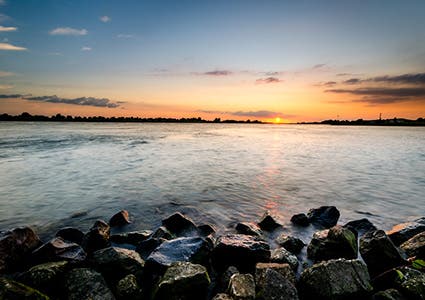
In the landscape photo above left, the horizon and the setting sun are placed along the lines observed by the rule of thirds, and the brighter areas of the sky and water are balanced by the darker area of the stones in the foreground.
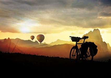
In the photo on the left, the differently sized subjects (bigger silhouetted bike and smaller hot air balloons) and the contrasting tones between the upper and bottom part of the frame create asymmetrical balance within the composition.
Color Balance
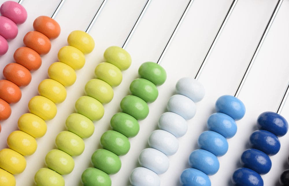
Another interesting way to create asymmetrical balance is by using colors. As you can imagine, a photo with too many vibrant colors, such as reds and oranges, may make an image look overwhelming. Color balance can be achieved by balancing out a small area of vibrant color with a larger area of neutral or more pastel colors, and vice versa.
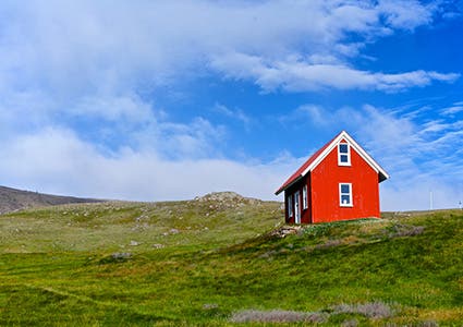
In the image above, the rainbow-colored abacus beads would have been too heavy on the eyes if it were placed on a colored surface instead of a plain, white surface. Both images below were placed off center and are not balanced out by a second subject, but are balanced out by more neutral and less striking colors around them.

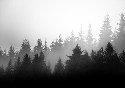
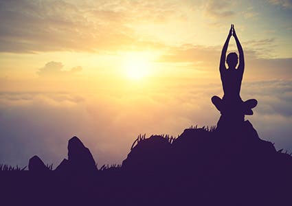
Tonal Balance
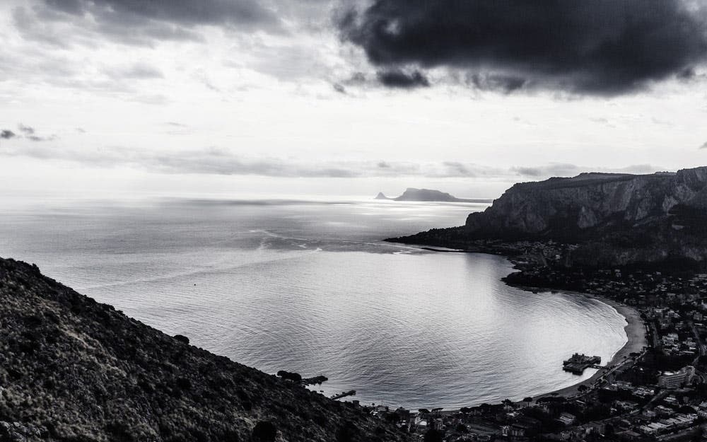
This kind of asymmetrical balance is best observed in monochromatic or black and white images where different tones are easily distinguishable. In this case, tonal balance is seen in terms of contrast between lighter and darker areas within an image.
Like bright colors, darker areas are “heavier” on the eyes and are best balanced out by bigger, lighter areas. These are observed in the photos below, where the foregrounds are darker and are in harmony with the lighter backgrounds. The fact that the foreground subjects also observe the rule of thirds adds even more visual appeal to the images.
Conceptual Balance
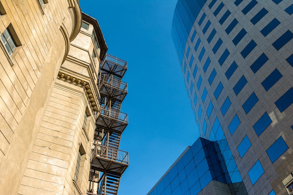
Conceptual balance is the more philosophical type of asymmetrical balance where two subjects complement each other and are different beyond size, shape and form. In many cases, conceptual balance is achieved in an image where there are two contrasting textures or meanings behind its subjects. That said, it is obviously harder to compose a conceptually balanced image as it usually takes more than just a tilt of the frame.
In the photo above, the two subjects (an old building and a high-rise glass building) are placed on the left and right sides of the frame. In addition to asymmetrical, color, and tonal balance, conceptual balance is achieved as the buildings showcase the effect of modernization and industrialization.
The same goes for the photo of the two kinds of windmills below. On the right, the photo of the denim pants shows color balance as well as conceptual balance, by contrast in textures between the distressed denim and the smoother, less textured surface around it
This information is from :
1) https://photographylife.com/what-is-composition-in photography
2)https://www.adorama.com/alc/what-is-balance-in-photography
3)https://photographylife.com/what-is-exposure
4)https://en.wikipedia.org/wiki/Rule_of_thirds
5)https://en.wikipedia.org/wiki/Shutter_speed


Comments
Post a Comment